Some people are anxious to deliver an inconvenient truth to Al Gore.
 |
| “The end is ... not near.” (Or is it?) |
 |
| This banner ad frequently pops up on climate science denial websites and blogs. |
 | |
|
“The figures,” Rose wrote in the Daily Mail, “... reveal that from the beginning of 1997 until August 2012, there was no discernible rise in aggregate global temperatures.”
The story went on to emphasize that this apparent hiatus in global warming indicates climate scientists may need to throw out the models that have led them to predict steady and heady warming, full steam ahead.
But are Rose, CFACT (heavily funded by pro-fossil fuel foundations and at least one disclosed corporate donor: ExxonMobil) and all the other climate change consensus deniers who have seized upon this graphic like a religious icon (a denier's flattened “hockey stick”) right?
Did global warming really stop 15 or 16 or 17 or whatever number of years ago (the chronology varies with the times, depending on when the best cherries are to be picked)?
One thing is for sure: the warming trend, at least as measured in the air at the surface of the earth or very near it (by satellites very low in the atmosphere), has taken a leave of absence since about 2002. But then it regularly does. Check out this GIF from skepticalscience.org which graphically shows the pattern:

As the climate scientists and climate buffs at Skeptical Science explain:
One of the most common misunderstandings amongst climate change "skeptics" is the difference between short-term noise and long-term signal. This animation shows how the same temperature data (green) that is used to determine the long-term global surface air warming trend of 0.16°C per decade (red) can be used inappropriately to "cherrypick" short time periods that show a cooling trend simply because the endpoints are carefully chosen and the trend is dominated by short-term noise in the data (blue steps). Isn't it strange how five periods of cooling can add up to a clear warming trend over the last 4 decades? Several factors can have a large impact on short-term temperatures, such as oceanic cycles like the El Niño Southern Oscillation (ENSO) or the 11-year solar cycle. These short-term cycles don't have long-term effects on the Earth's temperature, unlike the continuing upward trend caused by global warming from human greenhouse gas emissions.To be sure, this appears to be the longest surface temperature warming plateau we've had since about 1980. But there was another pause almost as scary for Al Gore (if he was as naive as the people preyed upon by the activist deniers) as recently as 1997:
 |
| Sixteen years ago, the 16-year temperature trend was nothing to write home about either. Because it wasn't statistically significant, deniers could triumphantly have told Gore then, as now, that there's “no global warming.” |
And if you cherry-pick the dataset most loved by the deniers – the UAH (University of Alabama in Hadley) dataset, maintained by two climate scientists (John Christy and Roy Spencer) who themselves outspokenly reject (Spencer) or minimize (Christy) the consensus on climate change – you'll see that the first 16+ years of their analysis of the satellite record – which begins late in 1978 – should have been enough to cause Al Gore to retreat into seclusion and perhaps slit his throat:

So if there was flat or flattish warming from 1981 to 1997 according to HadCRUT4 and no warming since then according to the Daily Mail and company, then there must be no warming from 1981 thru today. Right? And Al Gore's expectations for the pancake-flat UAH temperature trend prior to 1996 should be similarly dismal (but it's a good thing he didn't slit his throat). Yet here's what the record actually shows in each case:
 |
| HadCRUT4, 1981–present |
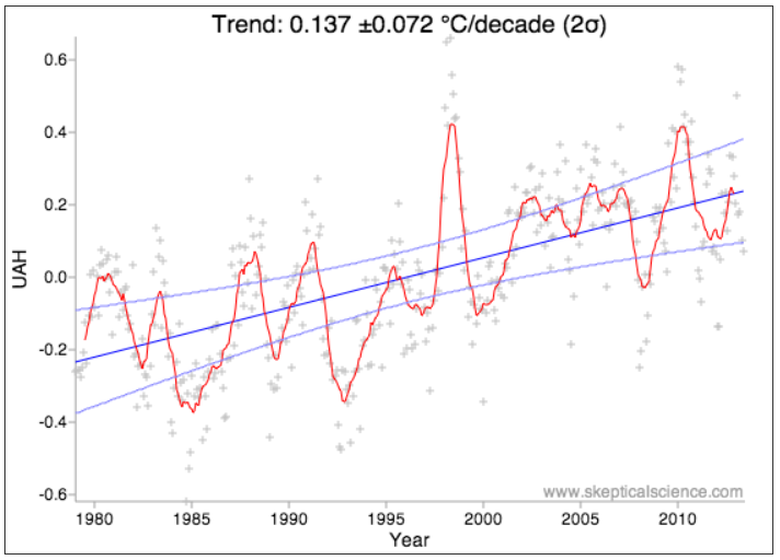 |
| UAH, 1979–present |
- Between 1981 and early 2013, according to HadCRUT4, the planet's surface temperature over land and sea grew at an average rate of about 0.16 degrees C. per decade, give or take 0.047 degrees. Statistical analysis says the odds are better than 95 percent the warming trend was between 1.14 and 2.08 degrees per century.
- Between 1979 and early 2013, according to UAH, the planet's near-surface temperature over land and sea (measured by satellites a few kilometres up) grew at an average rate of about 0.14 degrees C. per decade, give or take 0.072 degrees. Statistical analysis says the odds are better than 95 percent the warming trend was between 0.65 and 2.09 degrees per century.
No comments:
Post a Comment